Justin VanNatta
 

Portfolio 


Branding & Product Design

FOLLOW - Father & Son Bird Watching Kit

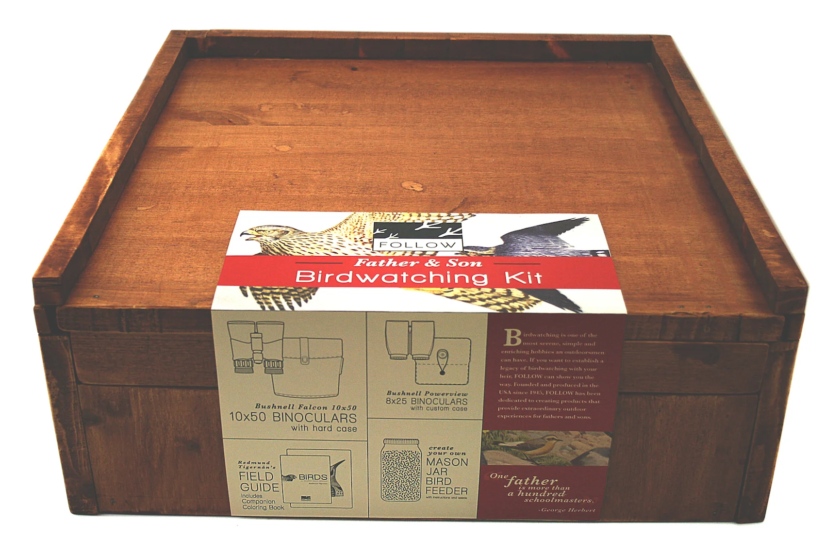
The FOLLOW brand is a provider of upscale outdoor education systems with a focus on parenting and family relationship building. The original concept for this kit came from my family's story of how I used to scribble in my father's bird identification book after seeing him keep notes in it. This product aims to bring father and son together through bird watching, but without ruining any books. 

The stained wood, dark leather, and vintage bird illustrations establish a sense of tradition, making this kit worthy of being handed down for generations. 

The Bird Watching Kit includes binoculars for both parent and child, a Birds of Western North America field guide with a matching coloring book field guide. The lid of the box serves as a field desk, complete with document sleeve and pencil holder. Also included is a mason jar full of black oil sunflower seeds with instructions on how to make a DIY bird feeder.

Spring 2013
Western Washington University


Branding

Whimsy Chocolates

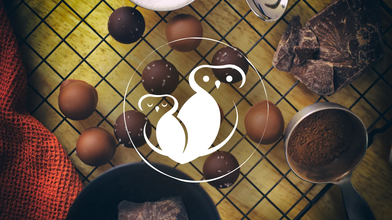
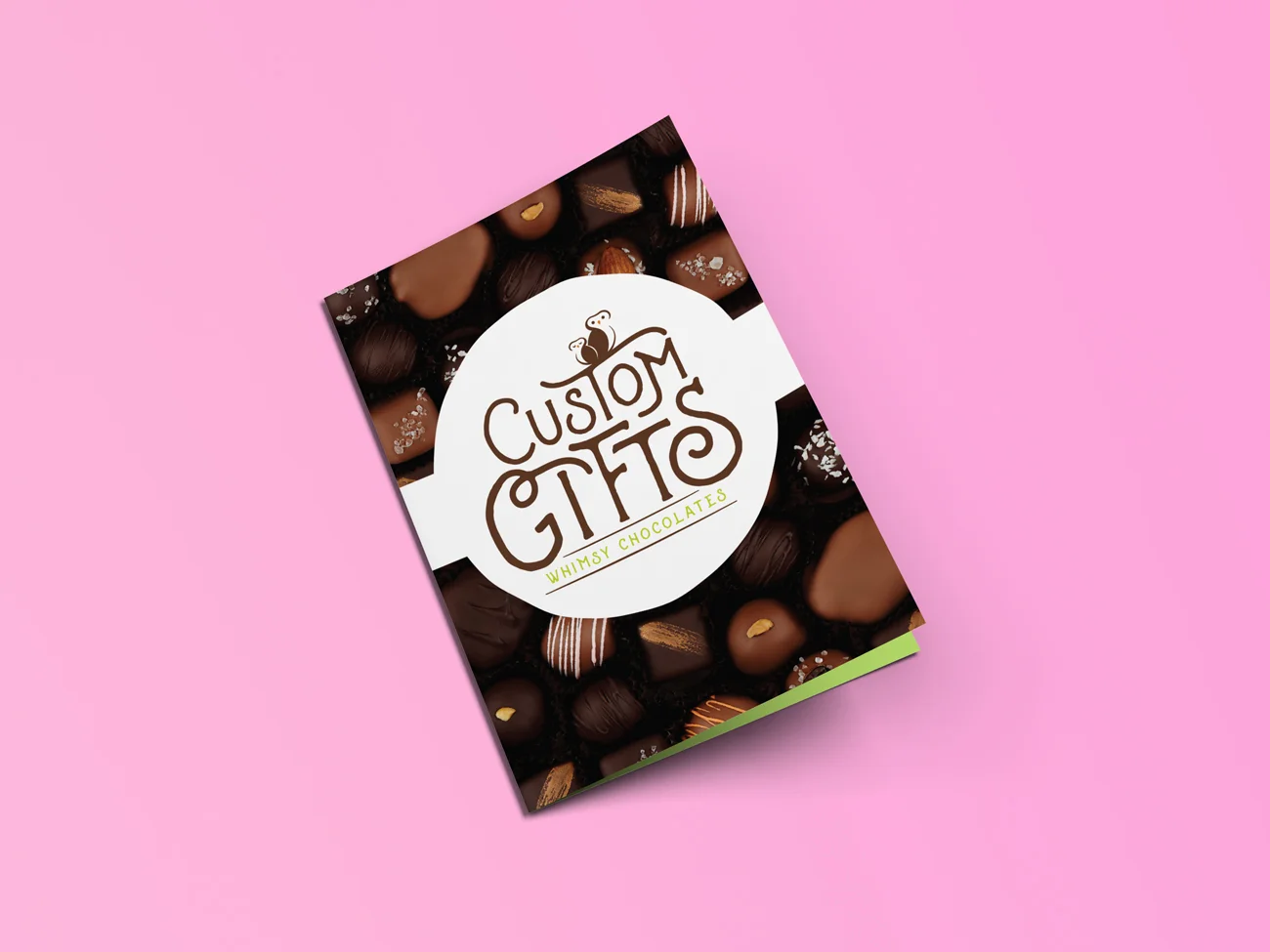
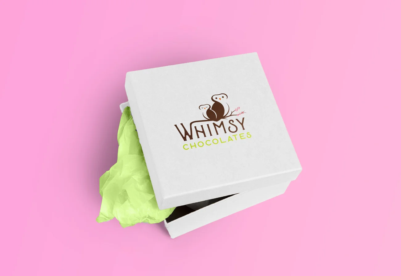
Pam and Ann Wanous, the founders of Whimsy Chocolates, create amazing hand-made sweets that are to-die-for. They contacted me when they began to expand and needed a more cohesive brand without loosing their recognition. The company's original logo featured two owls sitting on a cherry blossom, those elements remained but were gracefully (and severely) altered.

For almost a year now I've been working closely with Whimsy to achieve new heights. So far I've applied the new brand to business cards, trade-show banners, brochures, labels, and more. I also designed and built a Squarespace website that is fully equipped to handle their online sales for both retail and wholesale. 

Recently, I've been photographing their products (see below).

Whimsy Chocolate's branding is designed to match the quality of their products. Hand-made professionalism, tasteful elegance with just a hint of cuteness. 


Fall 2016 - Present
 

Photos by Justin VanNatta


Branding

Young Buck Brewing

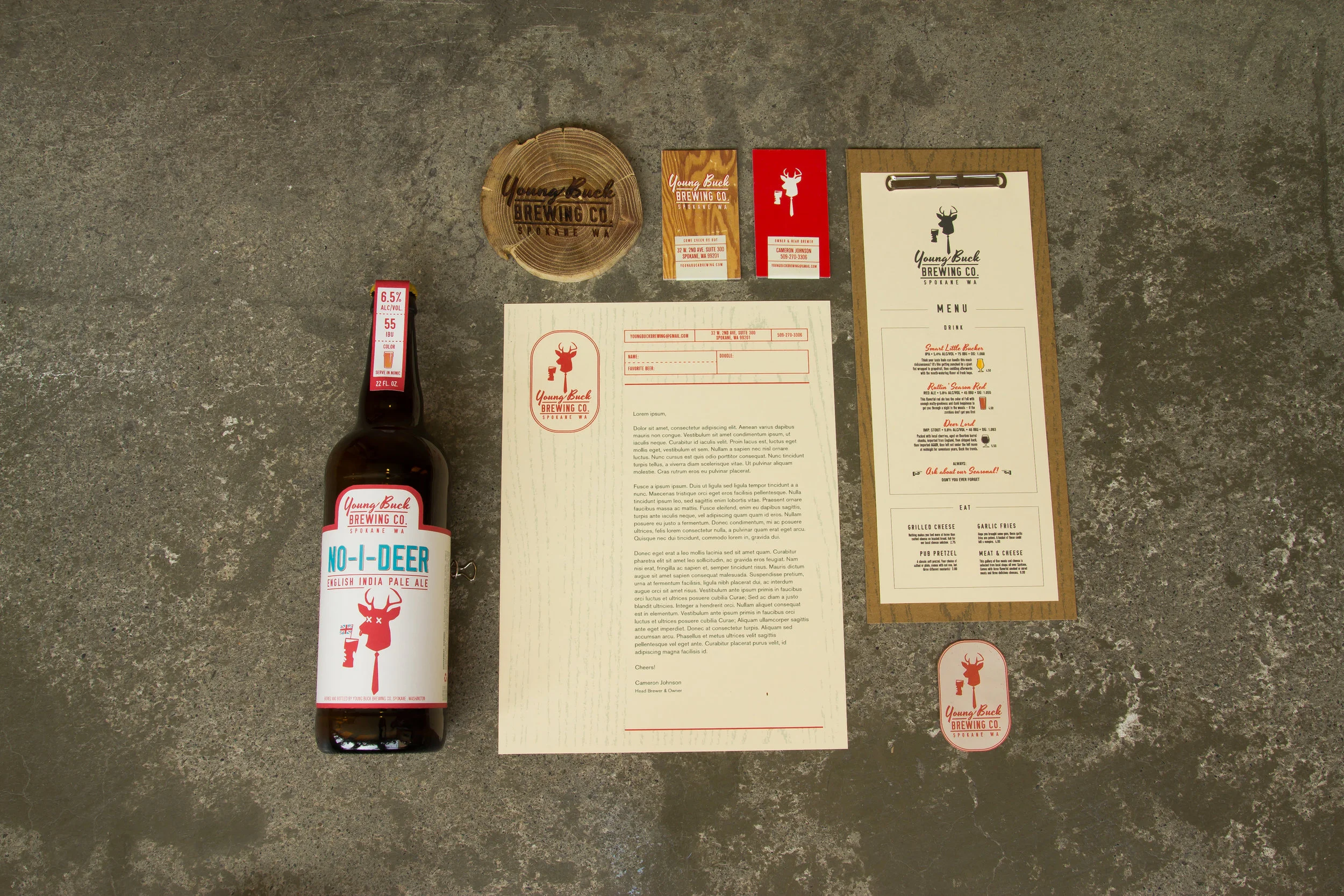
Cameron Johnson, owner of Young Buck Brewing, quit his career as an architect to pursue his passion for brewing unique and tasty craft beers. I was thrilled to hear his vision described as "awkward, awesome, and timeless, like a freshman in college". We certainly had some laughs (and beers) along the way as YBB became a reality. Young Buck Brewing is currently served in many of Spokane's bars, restaurants, and tap-houses.

Drawing from several art styles, the YBB brand has just the right amount of quirk and class. Art Deco illustration styles influenced the brand's poster art. The buck logo is derivative of Plakatstil, while the typography borrows from naive but blissful 1950’s American advertising. Wood panelling from the same midcentury era became the brands textural accent.

Spring 2014
Photos by Zach Becker


Posters & Illustrations

Poster art is my favorite thing in the whole wide world.

These samples range from volunteer work to my old job at WWU, and some just-for-fun work. 


Branding

Robert Spector, Inc.

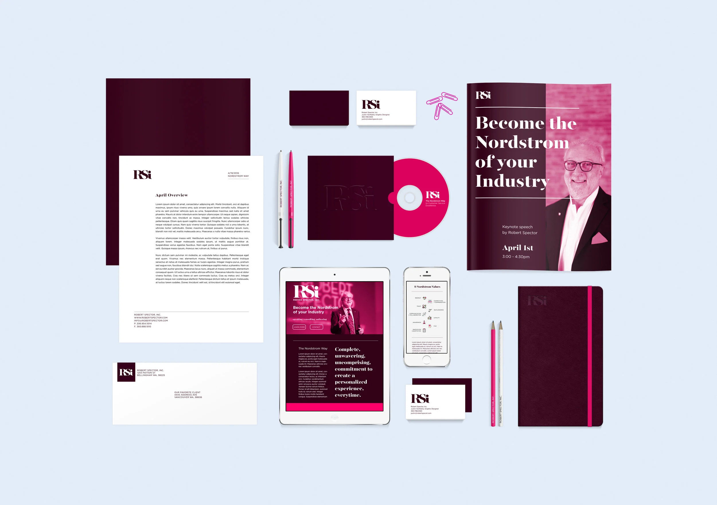
Robert Spector, Inc. is considered one of the top customer service experts in the world. Robert Spector himself is the author of the bestselling Nordstrom Way and continues to share his valuable insight through speaking engagements and talented writing. RSI promotes Spector's wisdom on the stage and on the page while also working directly with clients who seek in-depth customer service consultation. 

Since 2014, I have helped rebrand RSI, developed professional presentations for Spector to use, and played an important role designing many materials for their clients. I continue to work closely with them on a variety of projects. Along the way I have learned top notch customer experience/employee experience lessons that can be applied to businesses big and small.

Winter 2016